Every option in ProMax Pro, section by section. All are in Appearance › Customize and preview live. Colour settings left empty follow the colour scheme.
Customizer section
What's in it
Site Identity
Logo, site title, tagline, site icon (WordPress core)
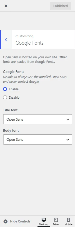
Google Fonts — turn off to always use the bundled Open Sans and never contact Google.
Enable
Title font — 63 fonts, including Roboto, Lato, Montserrat, Raleway, Oswald, Lora, Noto Serif and Ubuntu, plus display fonts such as Lobster and Pacifico.
Open Sans
Body font
Open Sans
Open Sans is hosted with the theme. Other fonts load from Google Fonts in a single request with font-display: swap, so text shows immediately while the font downloads.
Colors & Design
Setting
Default
Color scheme — 14 schemes plus Dark. See Colour schemes.
Default
Website width — 960–1920 px.
1200
Website layout — Right sidebar, Left sidebar, Full width. Posts and pages can override it in their Layout box.
Right sidebar
Header background
From scheme
Post and page title size (16–72 px) and colour
Theme default
Post card title size (12–40 px) and colour
Theme default
Body text size (12–24 px) and colour
Theme default
Link, link hover and button colours
From scheme
Page numbers: background, current page, text
From scheme
Sidebar headings: background, text
From scheme
Footer: widgets background, widget titles, links, copyright bar background
Load Font Awesome 4 icon font (only for fa fa-… classes)
Enable
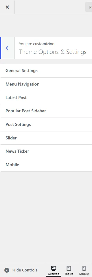
Menu Navigation
Setting
Default
Home icon: in the top navigation, in the main navigation, or hidden
Top navigation
Top navigation bar, plus background, hover/current item and link colours
Enable
Main navigation bar, plus background, hover/current item and link colours
Enable
Latest Post
Setting
Default
Latest posts strip below the navigation
Enable
Number of posts (1–8)
4
Only from this category
All categories
Title colour
From scheme
Popular Post Sidebar
Setting
Default
Popular posts in the sidebar (most comments first)
Enable
Heading
Popular Posts
Number of posts (1–12)
5
Post Settings
Post Settings.
Setting
Default
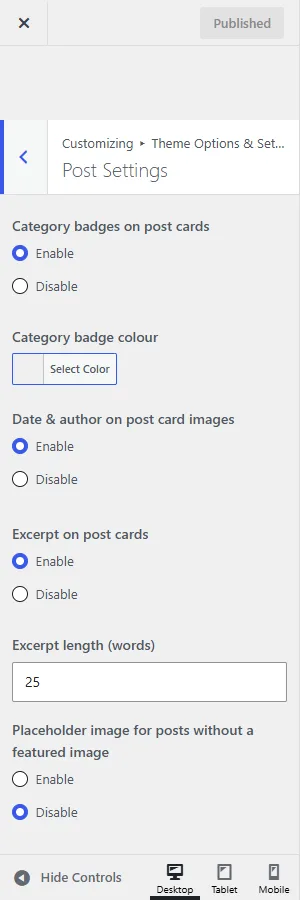
Category badges on post cards, and badge colour
Enable
Date & author on post card images
Enable
Excerpt on post cards
Enable
Excerpt length (5–100 words)
25
Placeholder image for posts without a featured image
Disable
Featured image on single posts
Disable
Breadcrumbs
Enable
Post date and author
Enable
Post categories
Enable
Comment count
Enable
Post tags
Enable
Author box below posts
Enable
Next and previous post links, plus background and hover colours
Enable
Share buttons below posts and pages
Disable
Slider
Slider on the blog home page (Enable by default; it only appears once a slide has an image), caption background colour, and for each of 4 slides: image, caption and link. See Slider.
News Ticker
News ticker below the navigation (Enable), label (Latest News), number of headlines (1–15, default 5), only from this category, label colour. See News ticker.
Mobile
Mobile.
Setting
Default
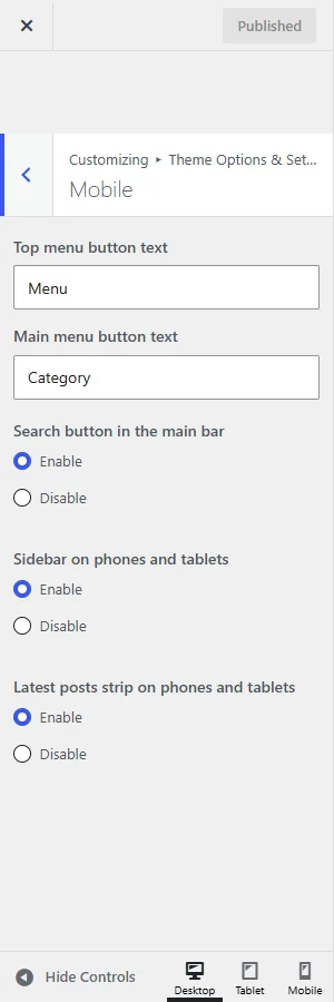
Top menu button text
Menu
Main menu button text
Category
Search button in the main bar
Enable
Sidebar on phones and tablets
Enable
Latest posts strip on phones and tablets
Enable
Social Icons
Right side of the top navigation bar chooses between Social icons, a Search form or Nothing (default). Choose Social icons, then fill in up to 19 icons: pick a network and paste the profile URL (mailto: for email). The networks are the same 35 as in the free theme.
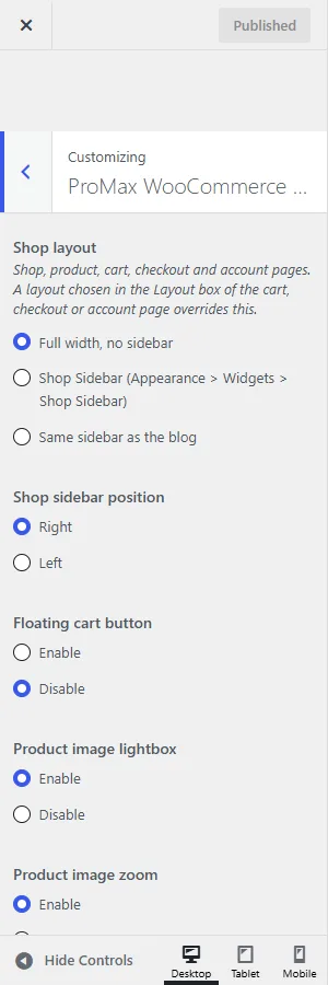
ProMax WooCommerce Settings
ProMax WooCommerce Settings.
Setting
Default
Shop layout: Full width, Shop Sidebar or the blog sidebar