Colour schemes
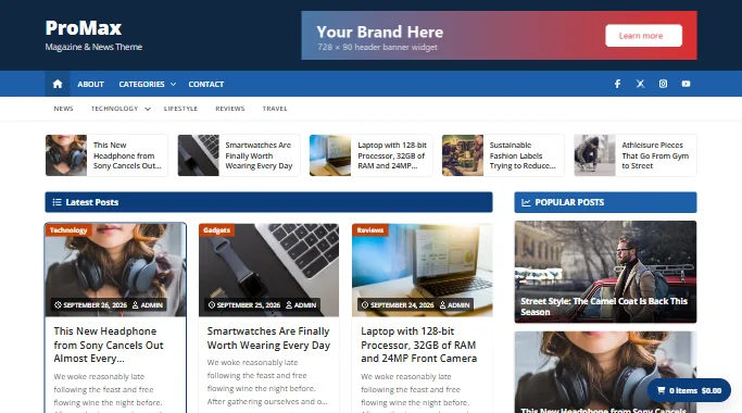
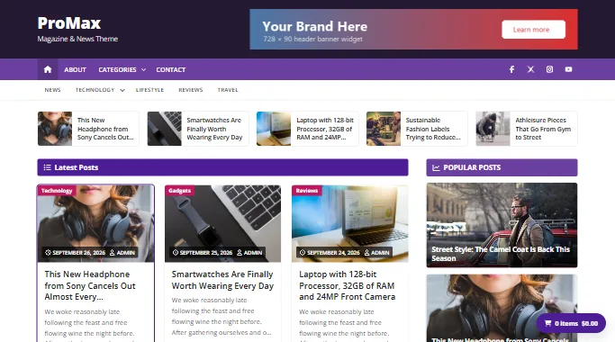
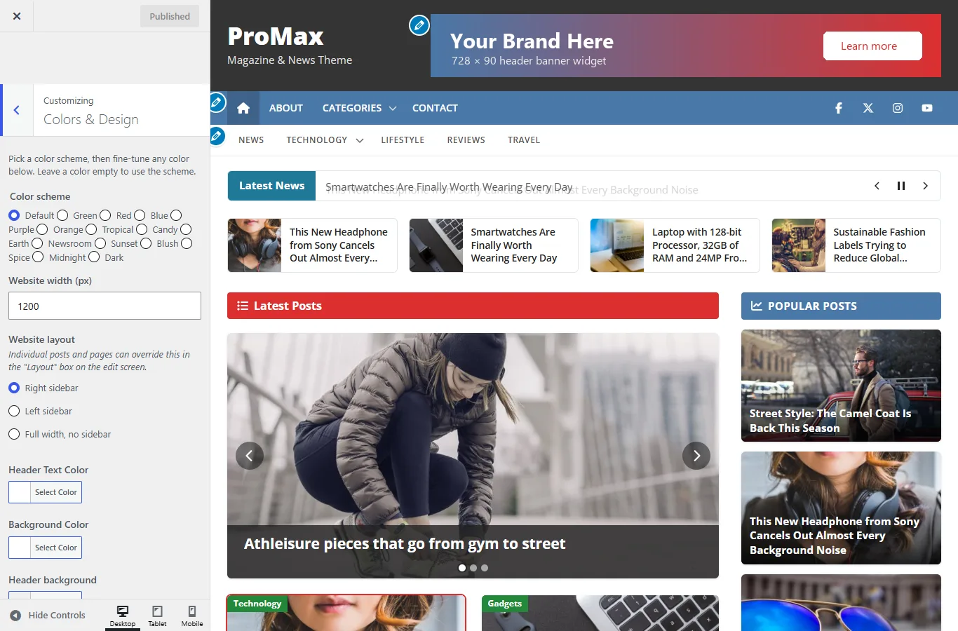
A colour scheme recolours the header, menus, heading bars, category badges, links, buttons and footer in one click. ProMax has 5 schemes; ProMax Pro has 14 plus a Dark mode and individual colour controls.
Choosing a scheme
- Go to Appearance › Customize.
- Open Colors & Layout (ProMax) or Colors & Design (ProMax Pro).
- Click a scheme. The preview updates straight away. Click Publish to keep it.
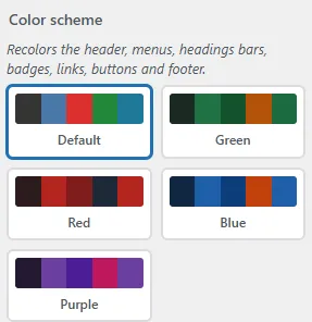
Every scheme meets WCAG AA contrast for text and buttons. The scheme also recolours the block editor's colour palette, so colours you pick for blocks match the site.
ProMax schemes Free
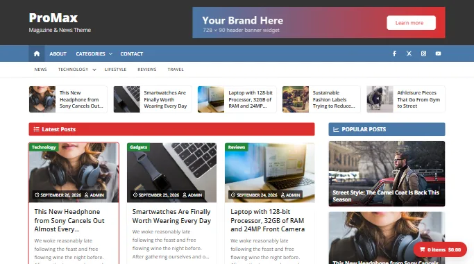
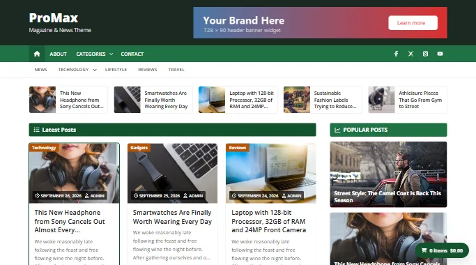
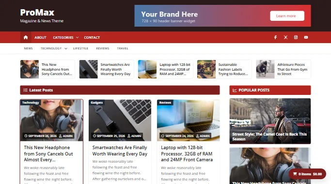
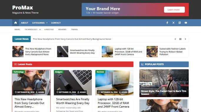
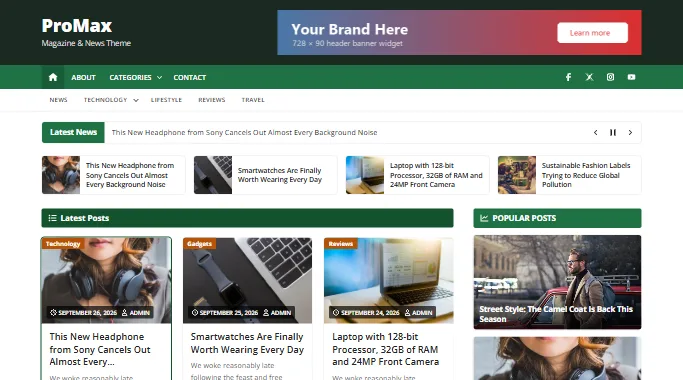
ProMax Pro schemes Pro
Pro includes the five schemes above plus Orange, eight palette-inspired schemes and a full Dark mode.
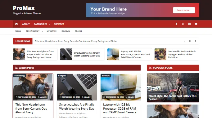
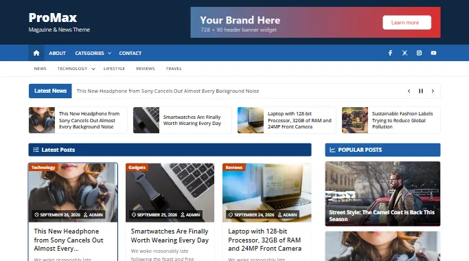
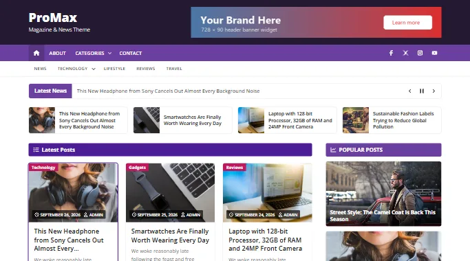
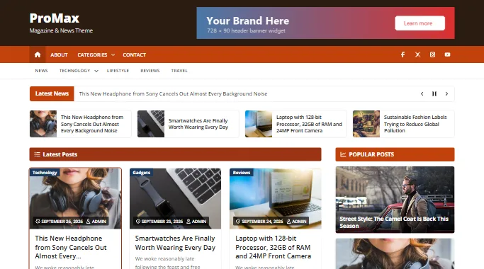
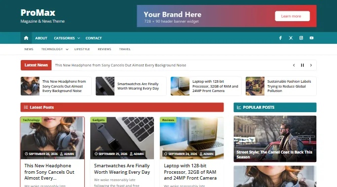
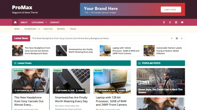
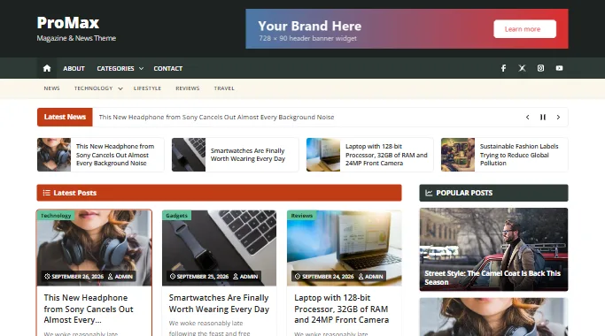
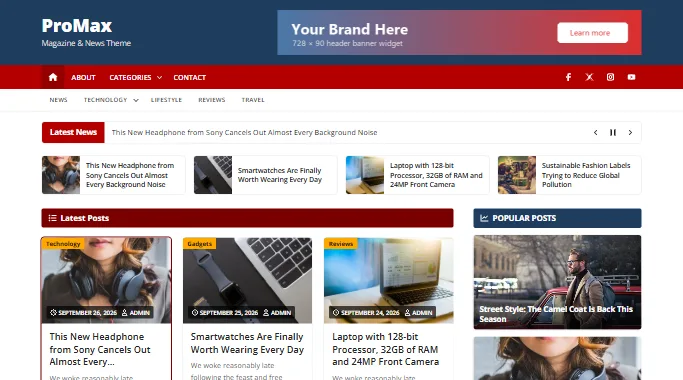
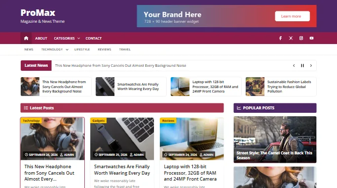
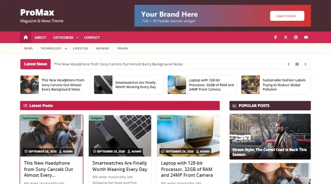
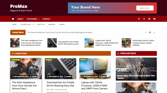
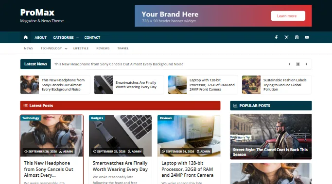
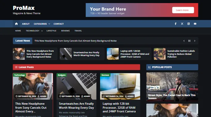
Dark mode
The Dark scheme switches the whole site to dark backgrounds with light text, including cards, menus, forms, tables and the block editor preview.
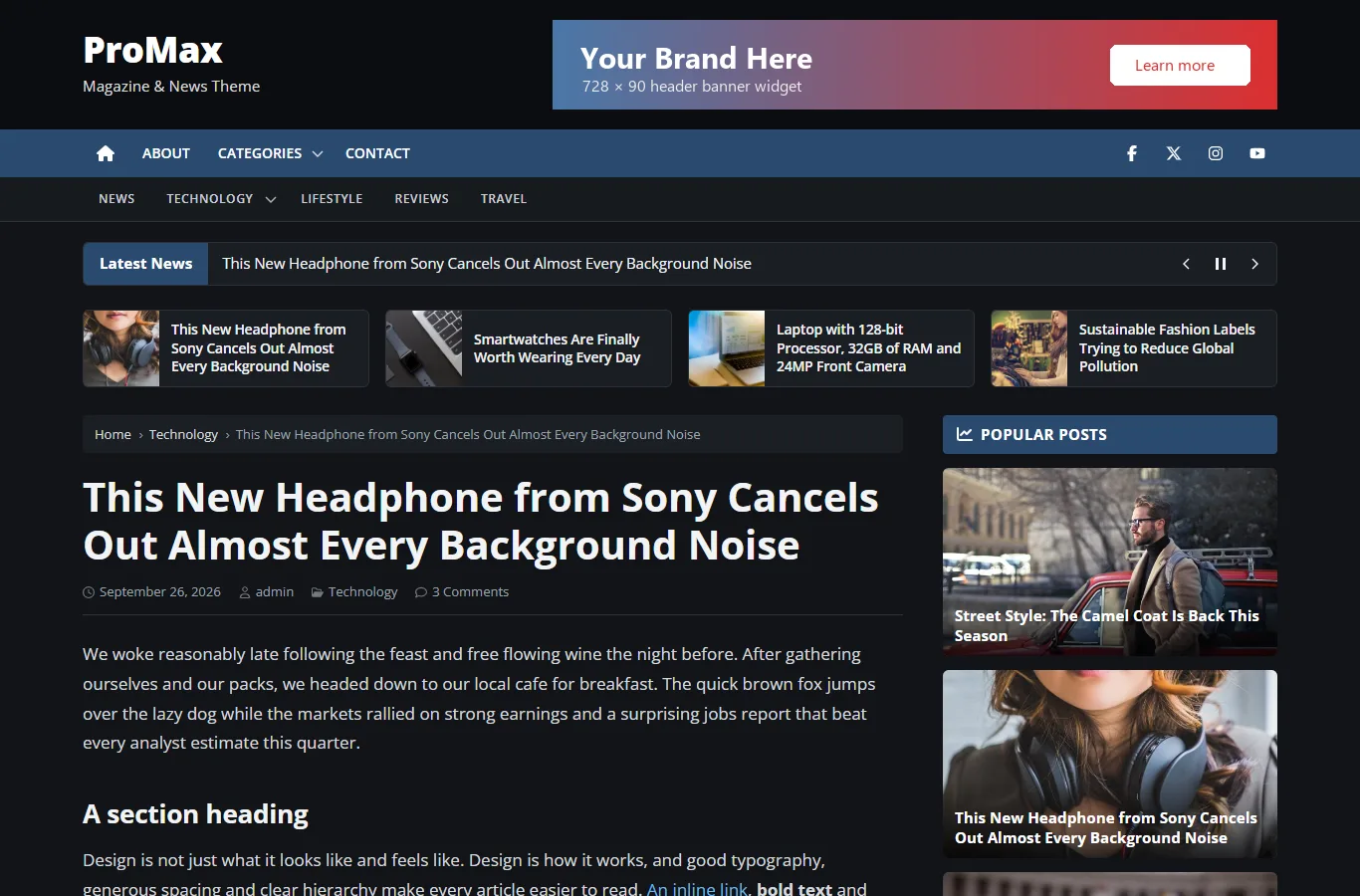
Fine-tuning colours Pro
Below the scheme picker, Colors & Design has a colour control for each part of the site. A colour you set always wins over the scheme. Leave a colour empty to follow the scheme, so changing schemes later still works.
| Where | Colour controls |
|---|---|
| Colors & Design | Header background; post and page title colour; post card title colour; body text; link and link hover; buttons; page numbers (background, current page, text); sidebar headings (background, text); footer widgets background, footer widget titles, footer links; copyright bar background |
| Theme Options › Menu Navigation | Top bar background, hover/current item and links; main bar background, hover/current item and links |
| Theme Options › General Settings | Heading bar above the post grid |
| Theme Options › Post Settings | Category badge; next/previous links background and hover |
| Theme Options › Latest Post | Latest posts strip title colour |
| Theme Options › Slider | Slide caption background |
| Theme Options › News Ticker | Ticker label colour |
| ProMax WooCommerce Settings | Quick Checkout button colour |
Pro also sets font sizes for post and page titles (16–72 px), card titles (12–40 px) and body text (12–24 px) in the same section. Leave them empty for the theme defaults.
Header image and background
Both editions support the WordPress Header Image (shown behind the logo area, 1350×140 recommended, any size works) and Background Image/colour panels. Header Text Color in the colours section changes the site title and tagline colour, or hides them when your logo already contains the name.