Blog & page layouts
Choose how posts are listed on the blog, archives and search results, how cards look, and where the sidebar goes.
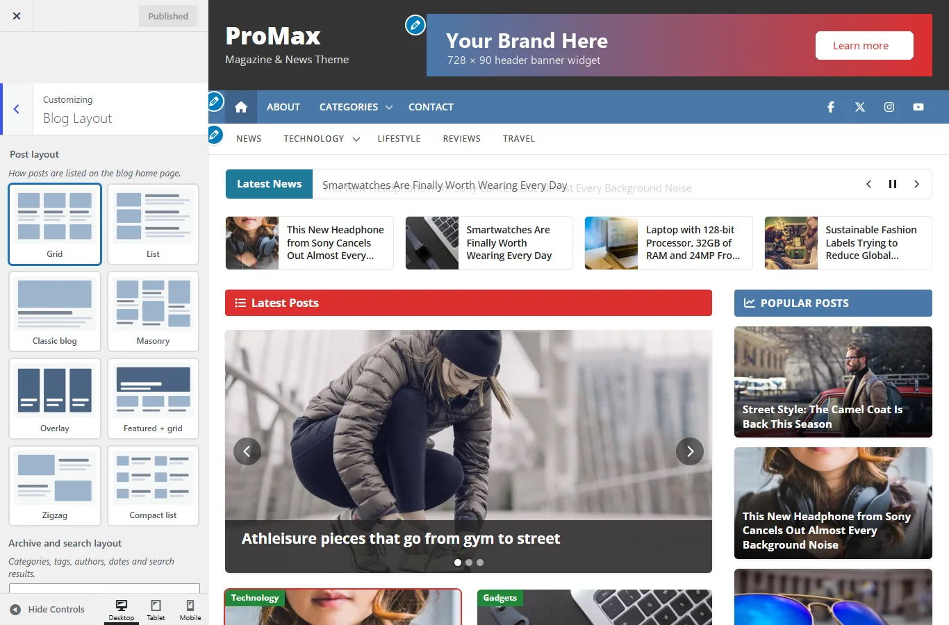
Post layouts
The post layout controls the blog home page, category, tag, author and date archives and search results.
On phones every layout becomes a single column of full-width cards, and both menu bars collapse into buttons.
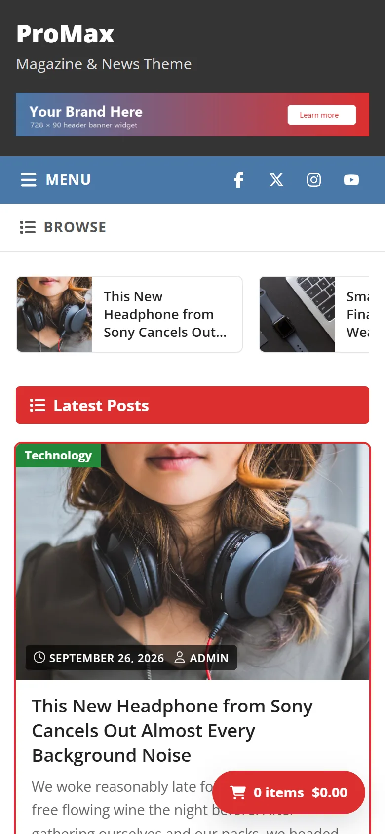
ProMax Free
Go to Customize › Colors & Layout › Post layout.
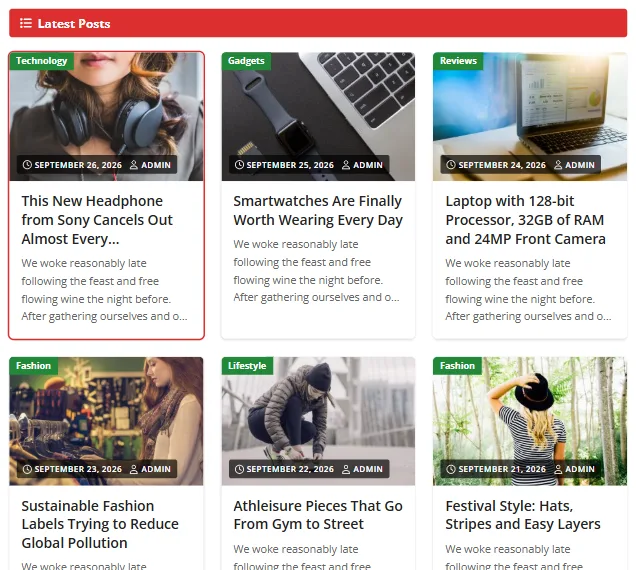
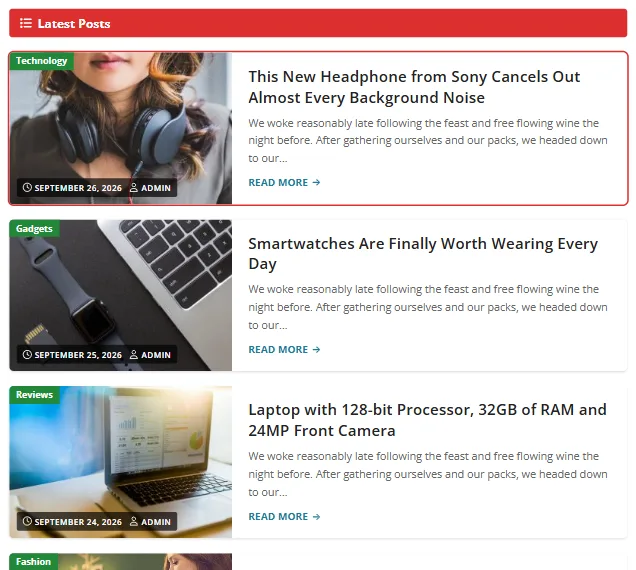
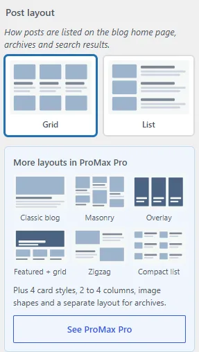
ProMax Pro Pro
Go to Customize › Blog Layout. Pro has 8 layouts and a separate Archive and search layout, so the home page can be a magazine layout while archives stay a simple list.
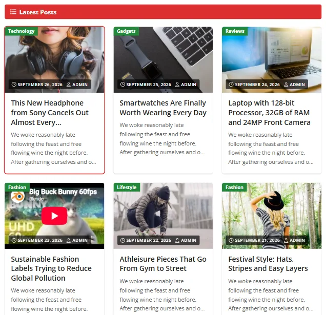
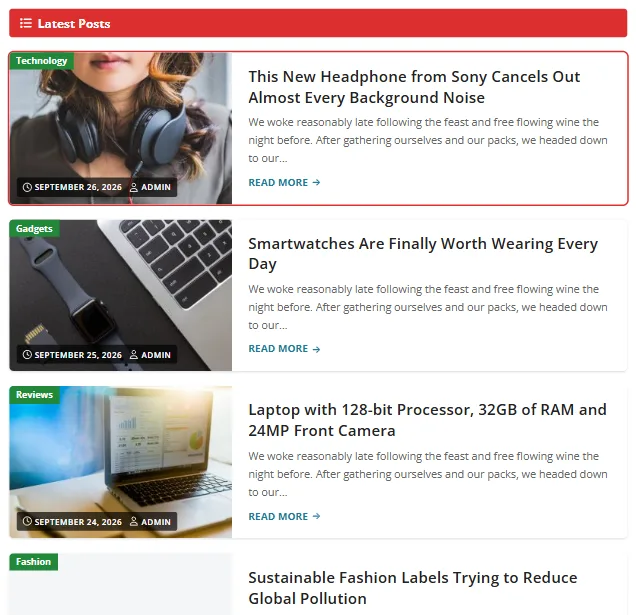
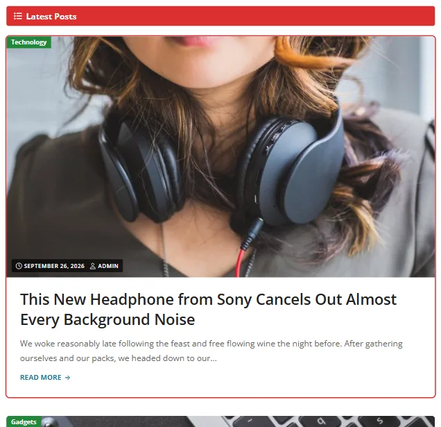
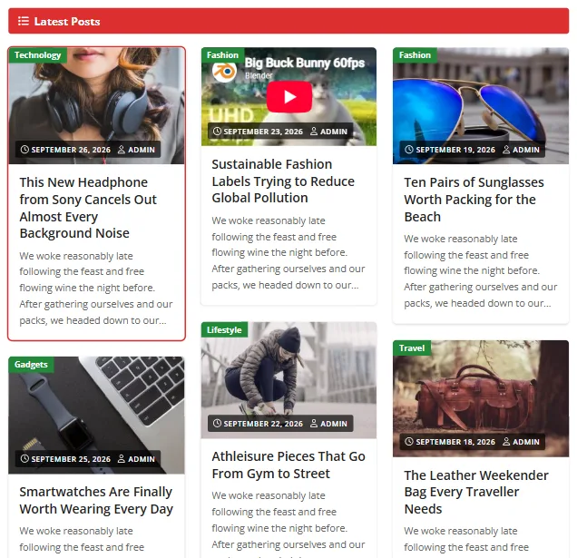
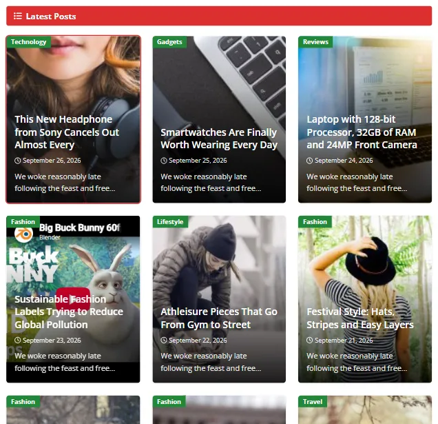
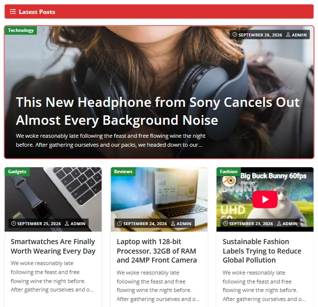
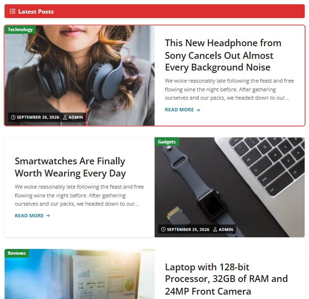
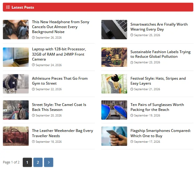
Card styles, columns and image shape Pro
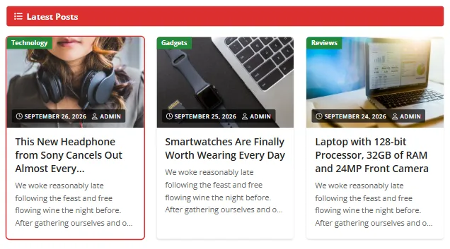
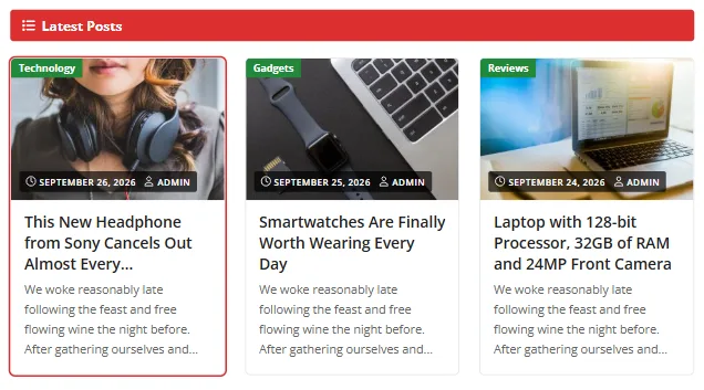
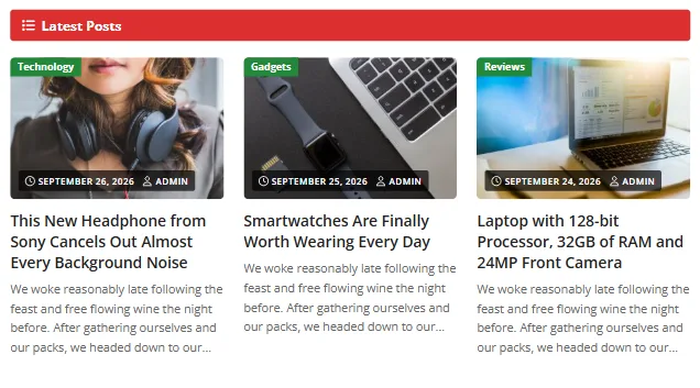
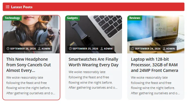
- Columns: Automatic (as many as fit), 2, 3 or 4. Applies to Grid, Masonry, Overlay and Featured. Phones always show one column.
- Image shape: Landscape 3:2 (default), Wide 16:9, Standard 4:3 or Square 1:1. Applies to Grid, List, Zigzag and Featured.
Card height
Equal height (default) trims long titles and excerpts so every card in a row lines up. Fit content shows everything and lets cards grow. In ProMax it's in Colors & Layout; in Pro, in Blog Layout.
Website width
Website width sets the maximum width of the content, from 960 to 1920 px (default 1200). It's in Colors & Layout (ProMax) or Colors & Design (Pro).
Sidebar position
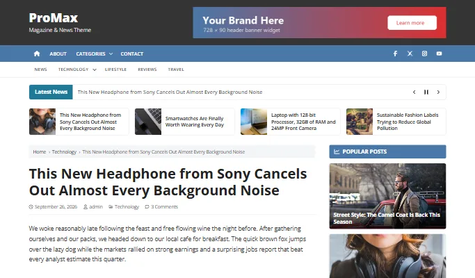
Free ProMax shows the sidebar on the right whenever it has widgets or the Popular Posts list. Without either, content goes full width.
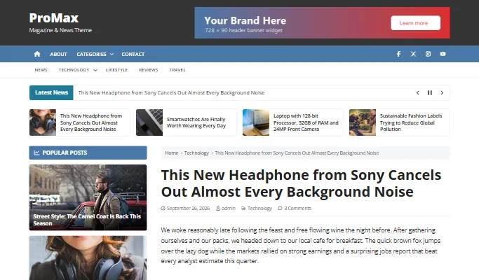
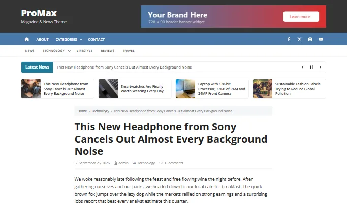
Pro Choose Right sidebar, Left sidebar or Full width for the whole site in Customize › Colors & Design › Website layout.
Per post and page Pro
Every post and page has a Layout box in the editor sidebar (under the Post or Page tab, near the bottom). Pick a layout for just that post, or leave Use theme setting.
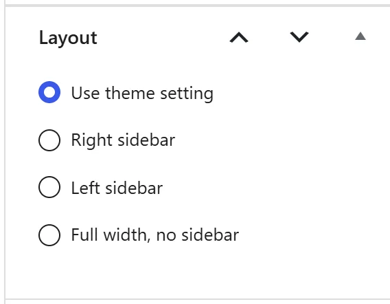
Good uses:
- Full width for landing pages, galleries and long guides.
- Left sidebar on a single section of the site.
- A layout for the WooCommerce cart, checkout or account page (see WooCommerce).
Single posts
- Featured image on single posts shows the featured image above the title, with the title on the image. Off by default. ProMax: Theme Options; Pro: Theme Options › Post Settings.
- Author box below posts (and pages in ProMax) shows the author's avatar and biography from their user profile.
- Pro Show or hide the date and author, categories, comment count, tags, next/previous links and breadcrumbs individually. See Post Settings.